Test analysis
The test data from two groups of students were available for testing the idea of a Bayesian analysis.
A python program was written to do the BKT analysis in conjunction with the existing in-house scientific analysis software to see what we can learn from this type of analysis.
Pre-BKT analysis
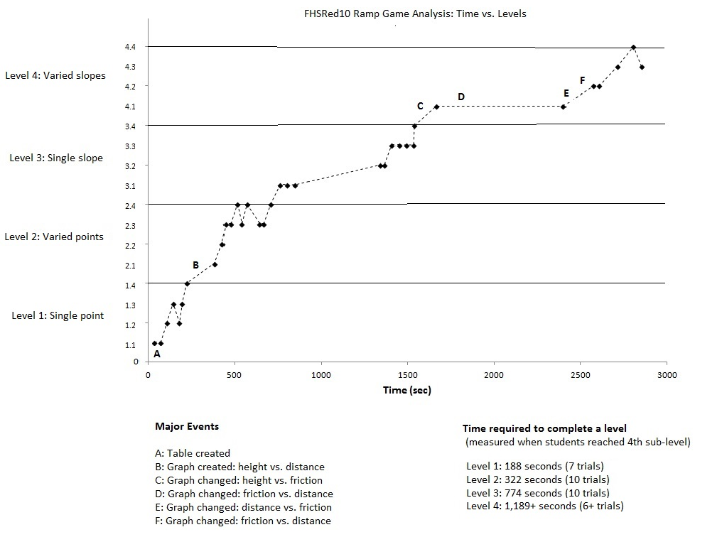
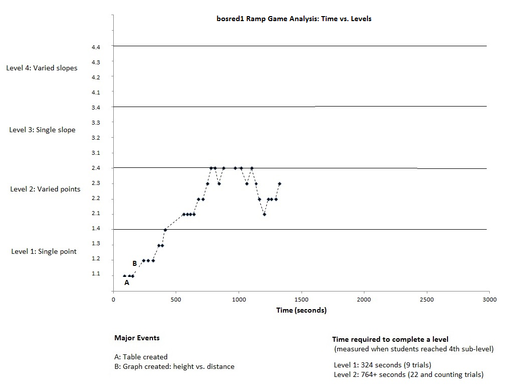
Here are two graphs showing the level as a function of time. Two groups, FHSRed10 and bosred1, of students participated in the same types of activity (ramp game). The first group proceeded all the way to the highest level of activities, while the second group did not proceed beyond level 2.
BKT analysis
Data
For the above data, different levels were defined as different sets of
data. So, the fhsred10 group produced four sets of data available for
analysis, while the bosred1 group produced only two.
Symbols
In the program pg, ps, pli, pt were used as symbols for
\(p(G), p(S), p(L_1), p(T)\), respectively. These symbols are explained in
Section Ingredients.
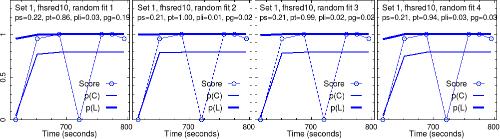
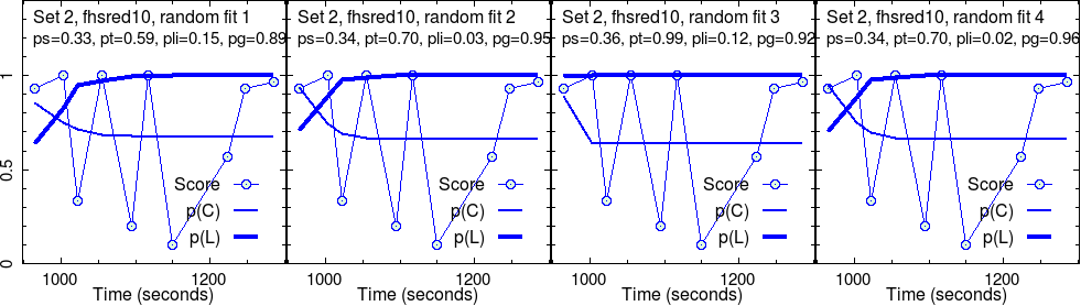
For each set of data, four different initial parameters for the four fit
parameters were selected in a completely random manner, each from 0 and 1 (a
more restrictive choice is possible [BakerWWW], which will tend to make the
results more robust—to do in the future).
Goals of analysis
By carrying out the analysis, we like to obtain numerical estimates of the above four parameters. Also, we like to estimate the real time student knowledge level \(p(L)\) by fitting the student score data with the theoretical estimate \(p(C)\), the likelihood that the student will get it right. Both \(p(L)\) and \(p(C)\) are function of the activity index \(n\) (cf. Inference chain), which is omitted here for brevity.
The activity index \(n\) is equivalent to the time, which is used as the x axis in all plots below. In this simple analysis, the time is not used for any other purpose, although perhaps in the future, it could be (cf. For the future).
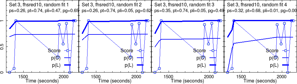
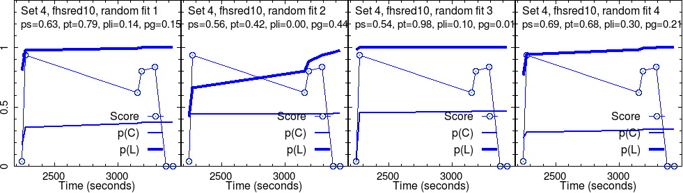
Results for group 1 (fhsred10)
This group completed four different sets of activities. As explained above, four randomly initialized test fits were run on each set. So, four images in a row.
For each randomly initialized fit, the program iteratively searched for the convergence point. Sometimes, this fails. More often, we have success. What we show are successful results only.
These converged parameters are reported in the second line in each panel. Graphs show the raw score data, along with their fit, \(p(C)\), and the estimated knowledge, \(p(L)\), that goes with it.
Here, we are concerned with only the robust outcome of the fit: the parameter values corresponding to each fit and the curves of \(p(C)\) and \(p(L)\).
Side note: The fit program also reports the uncertainties of the converged parameters—however, they are not robust. First, the uncertainty of the data cannot be known for sure, for one thing. Another reason is discussed in Section Optimization. Despite this, the relative uncertainties between different parameters still make sense. It turns out that by far, \(p(S)\) is the most certain parameter that comes out of fits. This is not surprising, given our discussion in Section Convergence.
Even if fit results make sense for one fit trial, if the results fluctuate too much between different trials, then it is an indication that those fit results are not reliable. This could be due to an over-modelling (too many fit parameters or too free fit parameters), which may be investigated in the future. Also, more data may help with more statistically meaningful fits.
Some core messages, already
By examining the above results, some core messages appear to form, already.
For instance, in set 1, the “effectiveness” of the activities, \(p(T)\) is very good, near perfect, \(p(T) \approx 1\), for this group. As the level grows, this seems to decrease, in addition with much fluctuation for the most challenging set (set 4).
The slip parameter \(p(S)\) is low for set 1, while it becomes quite high for set 4.
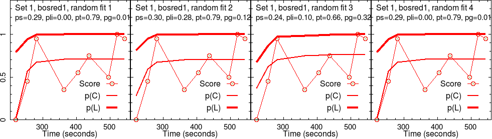
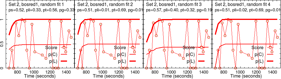
Results for group 2 (bosred1)
The second group’s results are analyzed the same way.
Comparison
It is interesting to see that \(p(T)\) for group 2 is much lower than that for group 1, for the same set of activities. Therefore, one would say that the effectiveness of activities was significantly lower fro group 2, which is why they spent more time, doing less.
It is also interesting to see that the slip parameter \(p(S)\) is significantly higher for group 2 for set 2 activities. For group 1, a similar level of slipperiness shows up only for set 4.
How about the overall knowledge level? Taking the initial value of \(p(L)\) for each set as being equal to the final value for the prior set, one can make a stacked plot like the following. Here, the first response time for the two group has been taken to be the same.
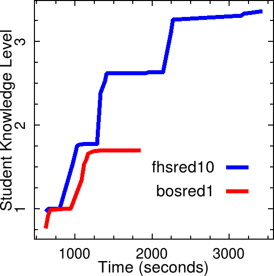
This graph suggests that group 1 progressed to higher and higher knowledge while group 2 remained at a lower level, showing a slower progression.
As the above discussion makes it clear, \(p(L)\) (which is plotted here after stacking and stitching) alone is not reflective of the learning or the knowledge. It seems that \(p(S)\) is also an important parameter that characterizes the student knowledge.